Using Ninja Layout Basics
First time users will immediately see the power and benifits of using ninjla layout. Ninja layout is the most powerful tool in the Album Builder arsenal. It does away for the need to tirelessly search through templates.
Open Ninja layout

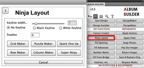
After you have created a canvas, use the marquee tool to select an area you want to design to and click on the "Ninja Layout" button to begin creating your album design.
How Ninja Layout is laid out.

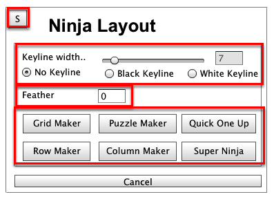
Ninja Layout is a very simple to use. You have three main controllers. Keylines, Feather, and the maker buttons. We will go over how to use each button in more detail below. But first, lets start out with the sticky "S".
Ninja Layout "Sticky"

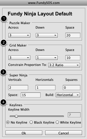
Just like with Canvas Creator, the Ninja Layout sticky is where you set your default settings for Ninjla Layout.
1) These are the default values that Puzzle Maker will use when opening.
2) These are the default values that Grid Maker will use when opening both Grid Maker AND Super Ninja Layout.
3) These are the defualt values that Super Ninja will use when opening.
4) These are your default keyline values that will open across Ninja Layout.
Keylines and feather

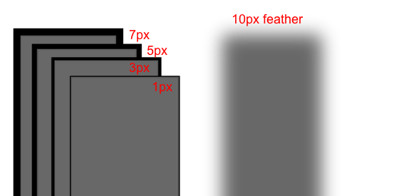
The above example shows how both keylines and feathering works. There are 4 different keylines that were used in the example. The higher the number of keyline, the larger the stroke will be. For example a keyline of 7 will give you a 7px stroke on the box. The image that will be placed in the box will be behind the keyline. In other words, the keyline will always show on top of the picture.
Feathering causes the edges of your box to gradient or fade out. I used a 10px feather for the top image. Its a good option when trying to fade a picture into something else on the page. It will keep the middle of the image sharp, while fading the edges.